MaxOptra Track & Trace
Bringing live location context into operations so teams could understand delivery reality at a glance and act faster, without leaving the product.
Who is MaxOptra?
MaxOptra is a route-optimisation and delivery-management platform. Logistics teams use it to plan routes, dispatch drivers, and track deliveries in real time. Track & Trace is the screen operators live in during a shift. It is the live picture of where every vehicle is and whether each drop is running to plan.
I redesigned Track & Trace around the question dispatchers ask all day: where is my driver, and will it arrive on time? The work replaced a slow, multi-tool workaround with one glanceable view. A four-minute scramble became a one-click answer.
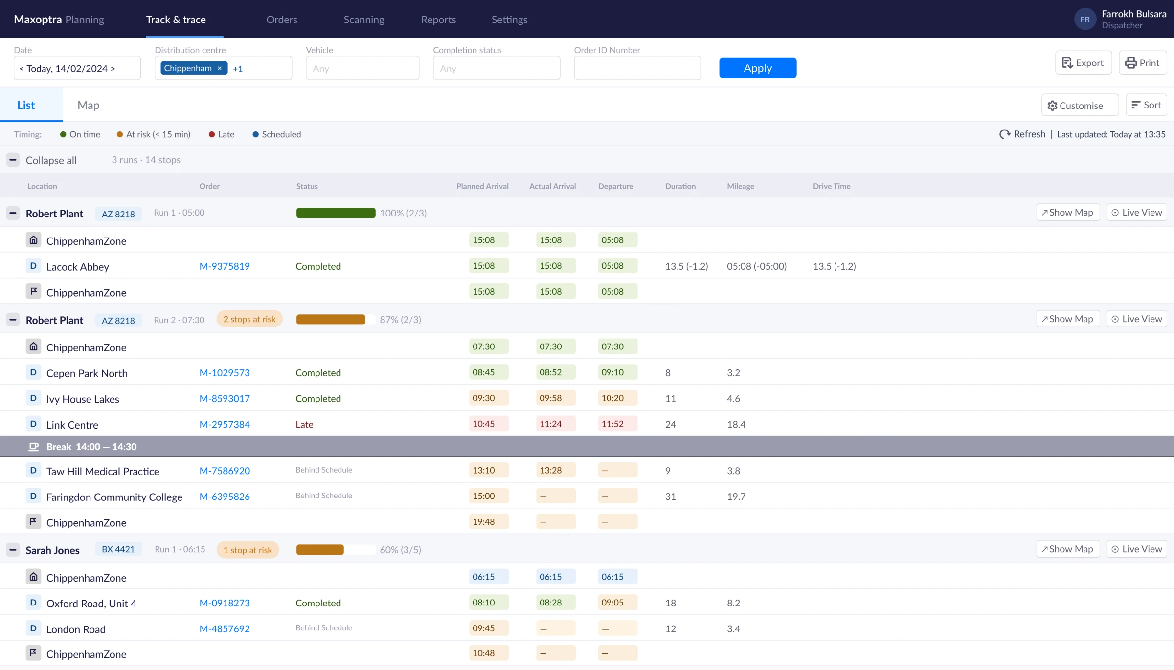
Good data. No context.
MaxOptra had timestamps, status flags, arrival times. What it lacked was location. When a stop flipped to “at risk”, operators opened a second browser tab, cross-referenced GPS data, and called their drivers. That sequence took four minutes, several times a shift. The data existed. The context to act on it did not.
“I’ve got the timestamps, but I don’t know if they’re moving or sat in traffic. I end up calling the driver just to know where they are.” Operator, stakeholder session
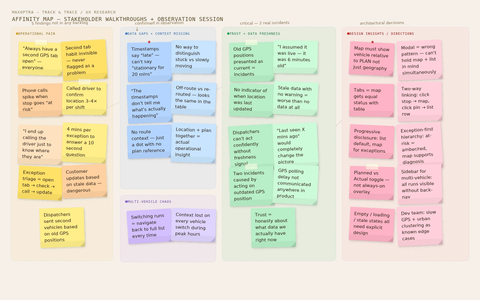
Five findings nobody had found.
Before touching wireframes, I ran a structured discovery phase. I facilitated stakeholder walkthroughs and watched a dispatcher work through a live morning run. The second a stop flipped to “at risk”, the dispatcher opened an external GPS tab, cross-referenced the timestamp, and called the driver. The whole sequence took about four minutes. The same information should have been available in under ten seconds. Asking people to narrate a real exception, a late delivery, surfaced pain points that were never in the backlog:
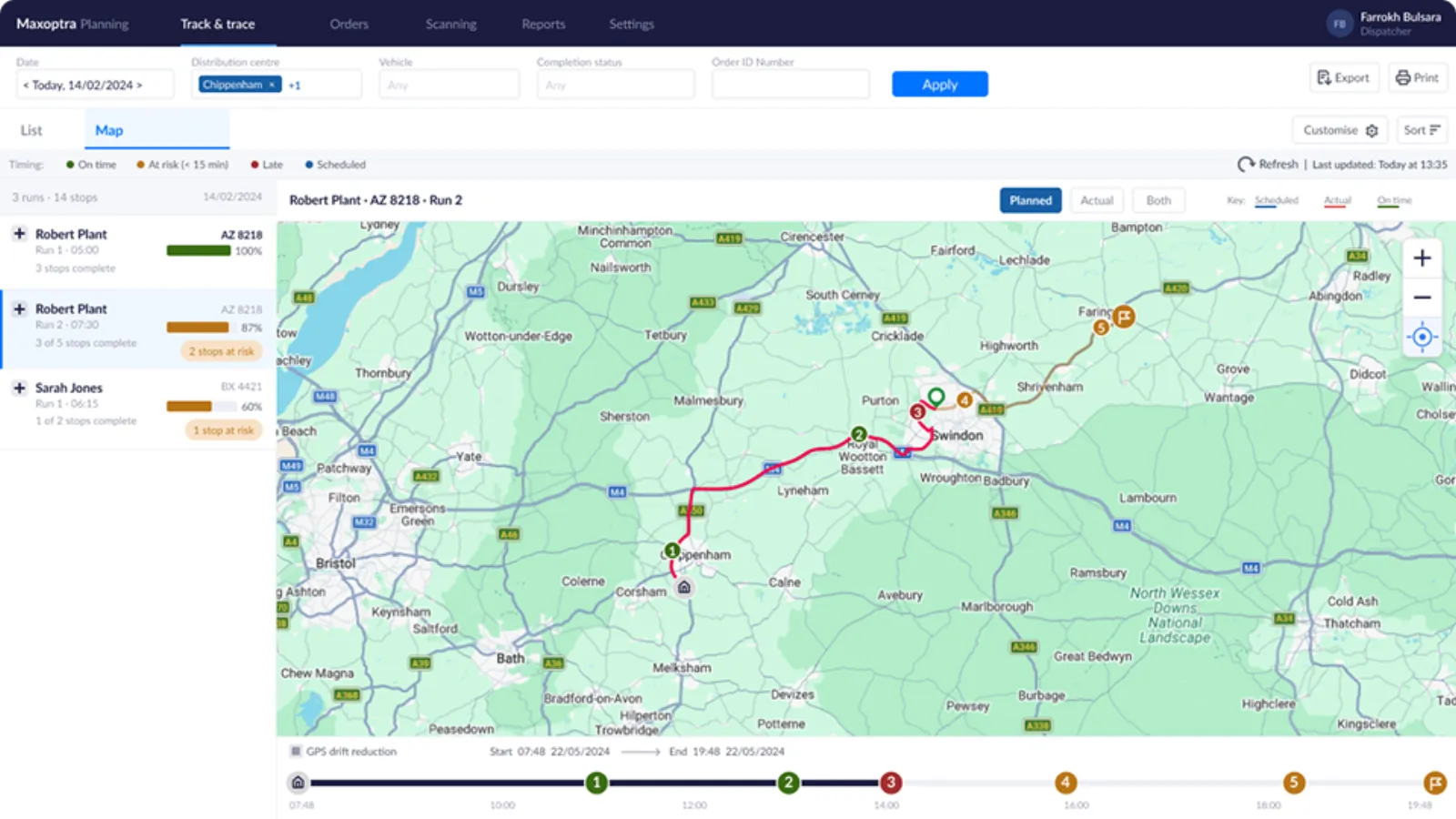
A map that equals the table.
The output of discovery shaped a focused brief: a Map view embedded inside Track & Trace, showing the vehicle’s current position alongside the full route and stop context from the existing table.
The original concept was a “Map” button on each row that opened a modal. I pushed back. A modal makes it impossible to reference map and list at the same time. I proposed page-level tabs instead, List and Map sitting side by side with equal status. That also unlocked a run-selector sidebar for multi-vehicle days, so dispatchers can switch between runs without returning to the list.
Three principles shaped every decision:
Decisions that shaped the product.
Four calls did the heavy lifting.
Same question. Different answer.
Open a second tab, cross-reference GPS coordinates, call the driver, wait, update the customer. Four minutes minimum, multiple times a shift.
Open the Map tab, see the live position against the route plan, click the at-risk pin, update the customer. Ten seconds.
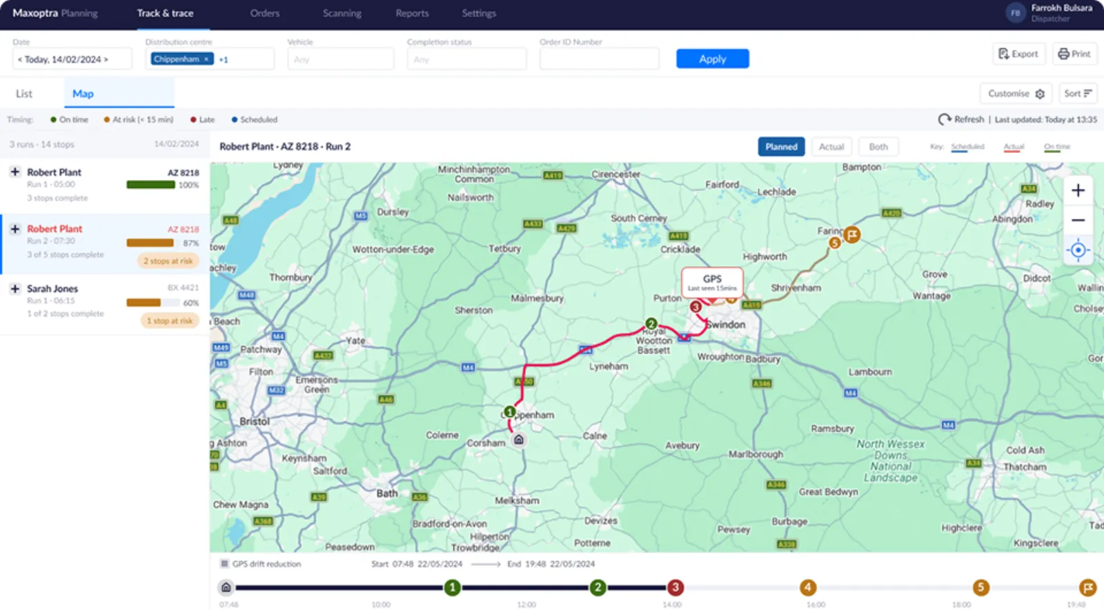
Designed for the messy reality.
Roads and warehouses are messy, so I designed for the failure modes too. No or stale GPS shows “last seen X mins ago” rather than a masked gap, and slow polling flags as stale automatically. Dense urban pins cluster into a count at lower zoom levels.
The off-route decision is worth calling out. When the actual track diverges from the planned route, the UI shows it factually, not as an error or violation. During the observation session, a dispatcher mentioned that ad-hoc route changes are common and legitimate. Labelling deviation as a problem would have created false alarms and eroded trust in the tool.
How we would measure success
Success criteria were agreed with the product manager before build: faster time to locate a driver, fewer “where is my driver” support calls, a higher success rate for exception triage, and Map-tab adoption by the majority of dispatchers in the first month.
Context is the product.
Specific UI details and client data are anonymised or altered due to NDA. The design process, decisions and rationale are my own.