01
Typing is the enemy
Manual entry in a warehouse is slow and error-prone. Scanning had to be the default with typing as genuine last resort.
Rebuilding the scanning app to be faster, calmer, and simpler.
Loading staff and drivers are working under real pressure, time-critical, one-handed, in poor lighting, with intermittent connectivity. Yet the original scanning prototype was asking them to navigate a complex, branching interface with too many decisions before a single item could be scanned.
On the surface it looked comprehensive, but in practice it created the opposite of confidence: too many routes through the UI, error states that felt like dead ends, and no clear ‘spine’ to the experience.
It needed to work like the warehouse, not like software.
I ran structured conversations with operations managers and warehouse team leads, asking them to walk me through a typical load cycle and describe where things went wrong. Three themes came up in almost every session:
Manual entry in a warehouse is slow and error-prone. Scanning had to be the default with typing as genuine last resort.
People arrive knowing what they need to do. Setup steps before scanning were friction with no value.
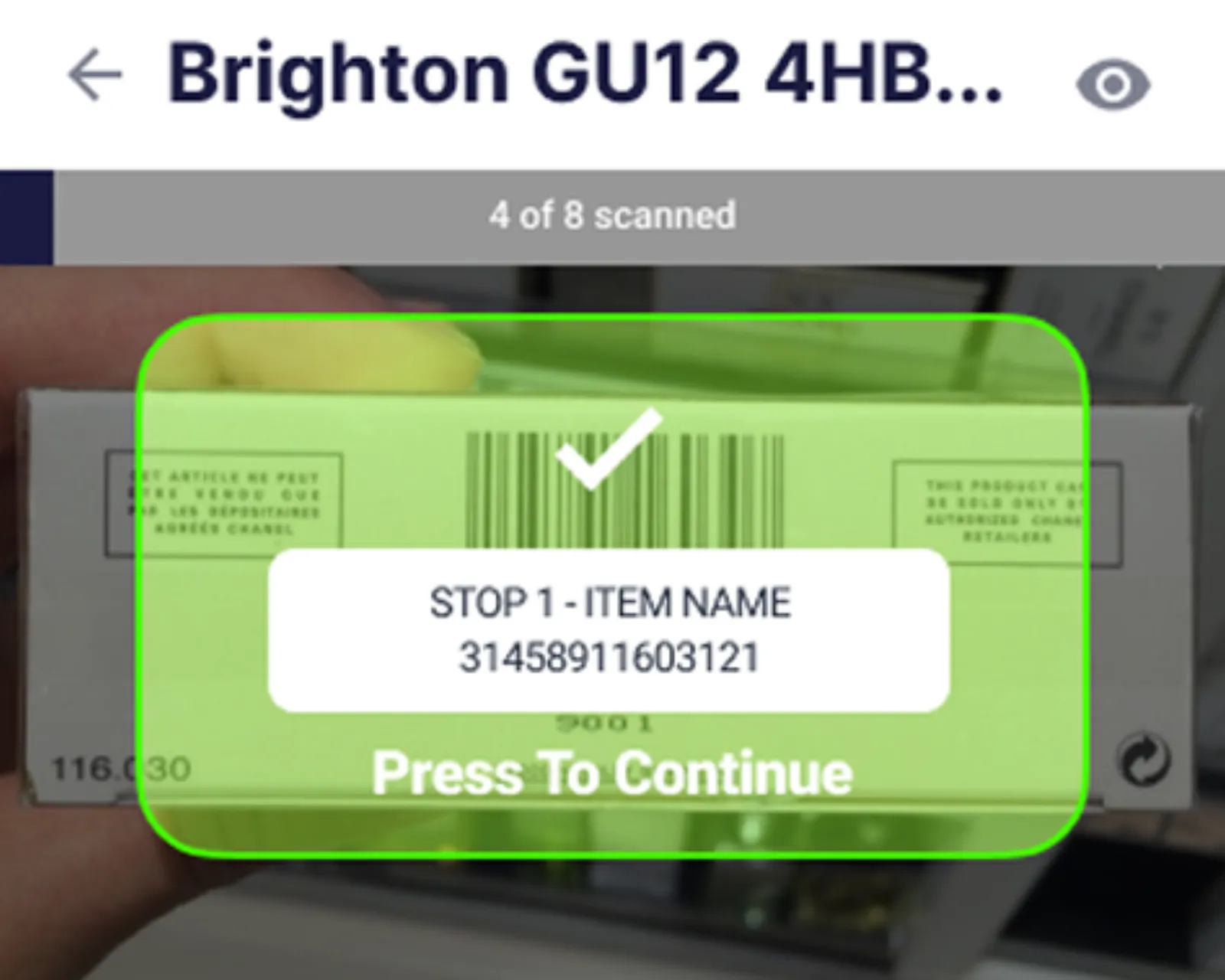
Any gap between action and confirmation creates doubt. Doubt leads to rescanning, which creates duplicates, which causes misloads.
I also reviewed competing warehouse scanning apps. Most leaned on the same branching-path model, but the better-performing tools shared one thing: they made the scan action the centre of the app, with everything else as supporting context.
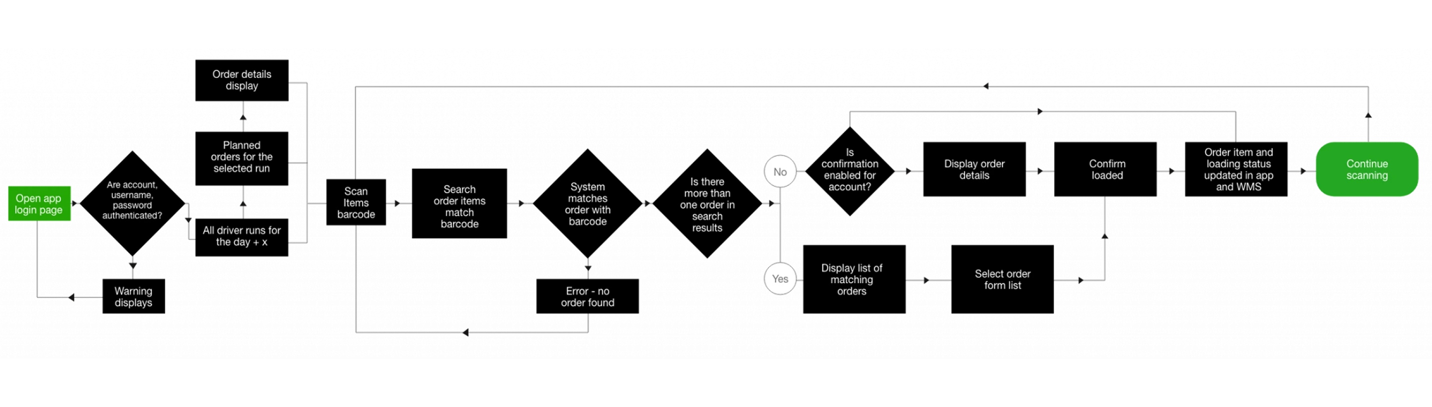
The design direction became clear: stop trying to support every scenario with separate screens. Reduce the entire experience to one essential loop and make exceptions part of the flow rather than dead ends.
SELECT RUN → SCAN ITEM → CONFIRM STATUS → PROGRESS TO NEXT
I tested two structural approaches:
We moved forward with Option B. The structured loop reduced cognitive load at the moment of highest time pressure, and search as a fallback reflected how users behaved in observation sessions.
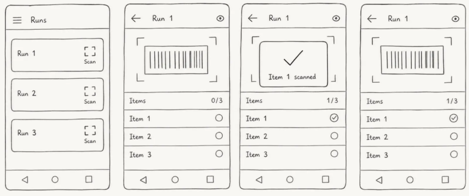
Confirm and advance.
Recoverable, no dead end.
Guided next step.
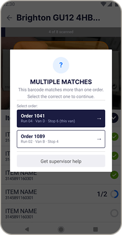
Force a deliberate choice.

Navigate setup screens before scanning anything. Hit an error, hit a dead end. Progress invisible. Every exception required supervisor input or a restart.
Open the app, scan. Confirmation is immediate. Progress is always on screen. Every error has a guided path out. The app stays calm even when the warehouse doesn’t.
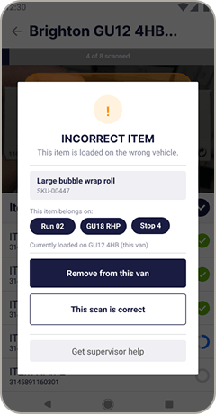
Warehouses are messy. The UX had to stay calm when things went wrong. I asked operations managers to describe the most common moments where the current system failed them or forced a workaround, and designed specific recovery paths for each:
Users move through a single predictable loop instead of branching decisions.
Scan is the default action: minimal typing, minimal taps.
Standardised confirmation states prevent silent errors and misloads.
Predictable exception recovery and clear, honest feedback at every step.
Metrics to validate scan task completion rate, misload reduction, time from first scan to dispatch-ready, and error recovery rate.
Currently taking on new briefs for design, UX, or motion.