Trap 01
Too spa-like
Calming visuals, vague language. Feels safe but builds no confidence in someone booking fertility treatment.
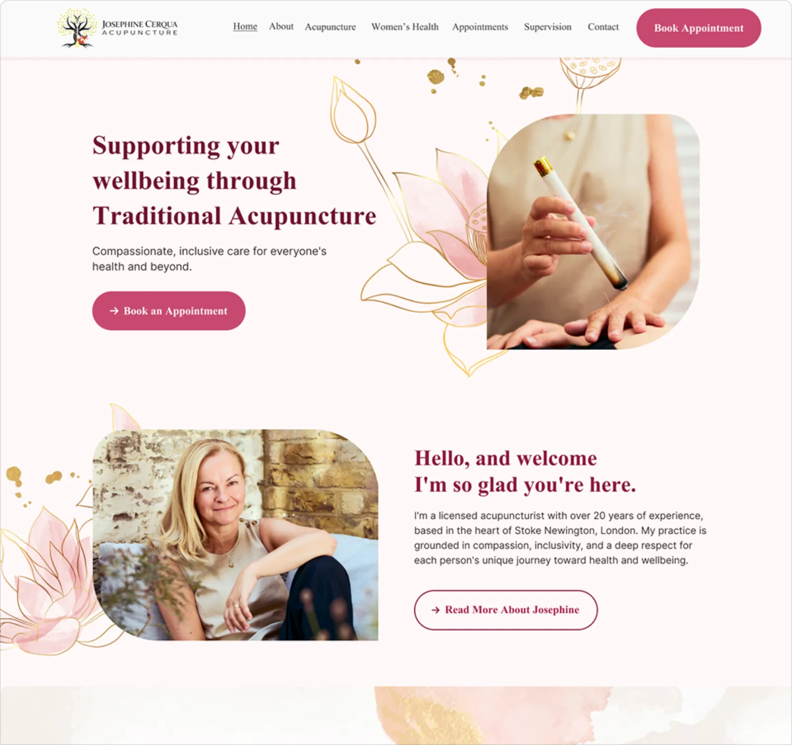
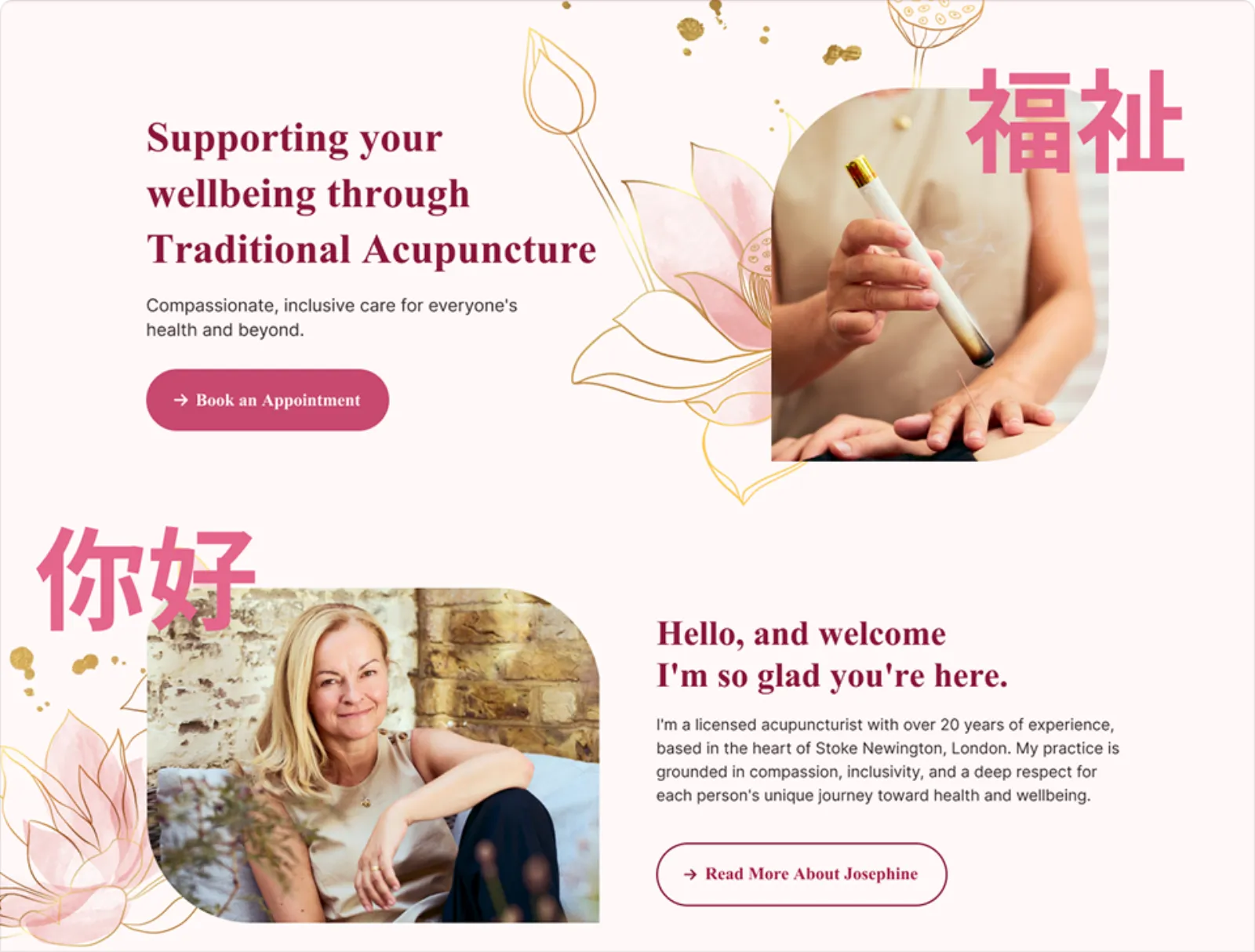
Brand and web identity for a specialist London practice. Calm, considered, precise.
Acupuncture sites often fall into two categories, but neither quite fits. Josephine’s site needed to be welcoming and expert at the same time.
Calming visuals, vague language. Feels safe but builds no confidence in someone booking fertility treatment.
Credible on paper. Intimidating in practice. Patients feel assessed, not welcomed.
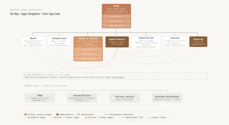
For someone booking acupuncture for the first time, the decision is emotional. Three questions need answering before anything else matters:
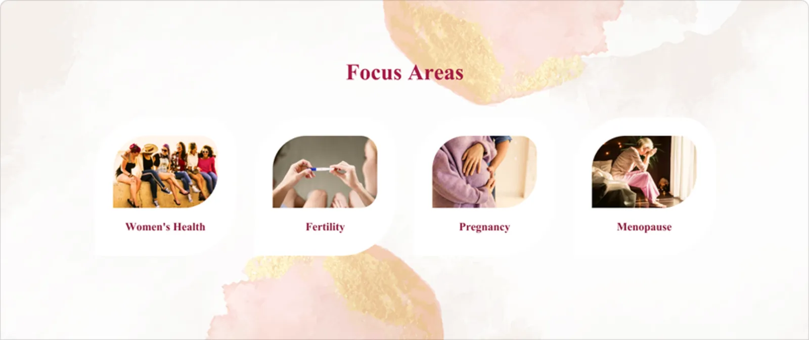
Visitors arrive with a specific problem. If the site doesn’t signal relevant expertise within seconds, they leave.
Acupuncture involves physical contact and personal health topics. Trust is built through tone and language, not credentials alone.
Small practical uncertainties stop people booking even when they’ve decided they want to.
This shaped the whole experience: instead of just explaining acupuncture, the site is designed to ease uncertainty at every step.
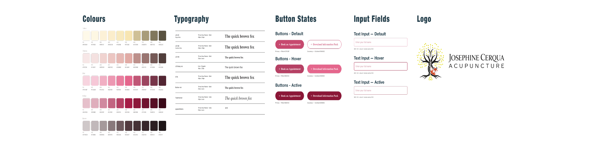
The design system reinforces the same message as the content: calm, inclusive, and safe. Colour, typography, buttons, and inputs all carry the same emotional register, warm without being vague, clinical without being cold.
We explored Chinese lettering as a brand element. During review we recognised the risk of aesthetic borrowing: using a language visually without cultural authorship or validation. For a practice built on trust, that risk was not worth a visual shortcut. We chose not to use it.
Long-term brand integrity over a short-term visual shortcut.
Currently taking on new briefs for design, UX, or motion.